Role(s)
UX Researcher, Product Designer
Timeframe
3 months
Toolkit
Figma, Google Workspace


Problem
Many UCI students experience moments when they want to share personal thoughts, feelings, or experiences but don't feel safe doing so on public platforms. Traditional social media is often tied to real names, followers, and social pressure, making it difficult to speak about difficult topics.
Solution
UCI TreeHole addresses this gap by creating a platform where students can post and interact anonymousy, using emotional tags and categories to help others find and relate to their stories. We propose that this will help promote open expression, reduce emotional isolation, and build authentic campus-wide dialogue.
encourage UCI students to speak their mind freely and find community in others across campus
01
A forum for students — inspired by students
The concept for this project was based on an activity, called "Tree Hole", that was held at Peking University on National College Student Health Day in 2017. The intent behind this activity was to encourage students to release their emotions, in addition to setting up a platform for students to share a moment with each other.
We felt — as fellow college students — that if we could transform this into a digital forum then students would be inclined to express themselves honestly and connect with others who may feel the same way.
Hence, UCI TreeHole was born!
02
Designing with the goal of user-friendliness
When designing UCI TreeHole, our team gained inspiration from other forums (e.g., Reddit) and social media apps, primarily to make our platform familiar to users at first glance.
We ideally wanted users to feel comfortable interacting with each other, hence why we felt the need to include frequently-used features, such as avatar randomization, emoji reactions and feed filtering on our platform.
The features we included in our design are as follows:
Anonymous posting with randomized username and avatar
Commenting and reacting to posts
Real-time feed with “Hot” and “New” toggle
Filtering through emotion and post category tags
Although simple….it's a well-perceived design!
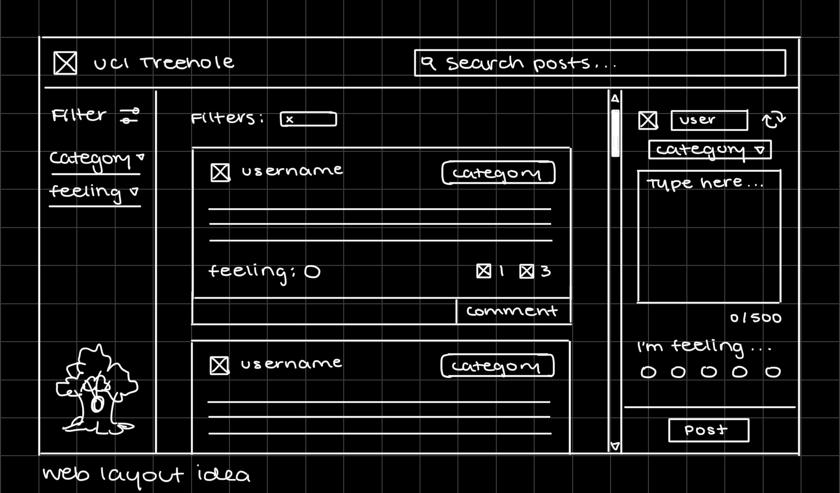
After creating a few initial sketches (such as the one above), we asked some potential users to provide feedback on the layout variations, features, aesthetic, and overall intuitiveness. As the lead UX researcher on our team, I was responsible for creating and maintaining our documents, developing usability prompts, and compiling research data.
Some comments left by users included:
Enjoying the 2000’s ambiance of the black and white design
Wanting to personalize their avatar and profile
Preferring action feedback (e.g. confirmation notifications)
Wanting to see a visual distinction for primary actions (e.g. posting, emoji reactions)
Considering these comments — as well as suggested improvements from users — we shifted our next round of iterations on the following:
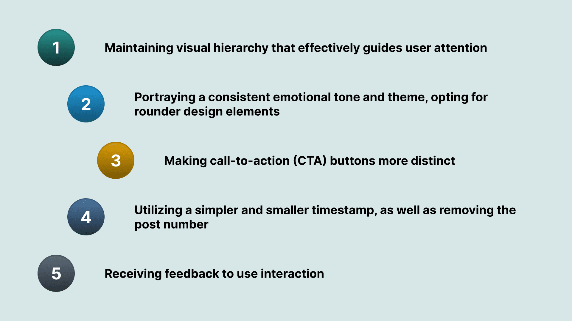
In addition, we added into our design the ability to toggle between viewing "New" or "Hot" posts, to tie into users' familiarity with social media feeds.
Testing our refined prototype
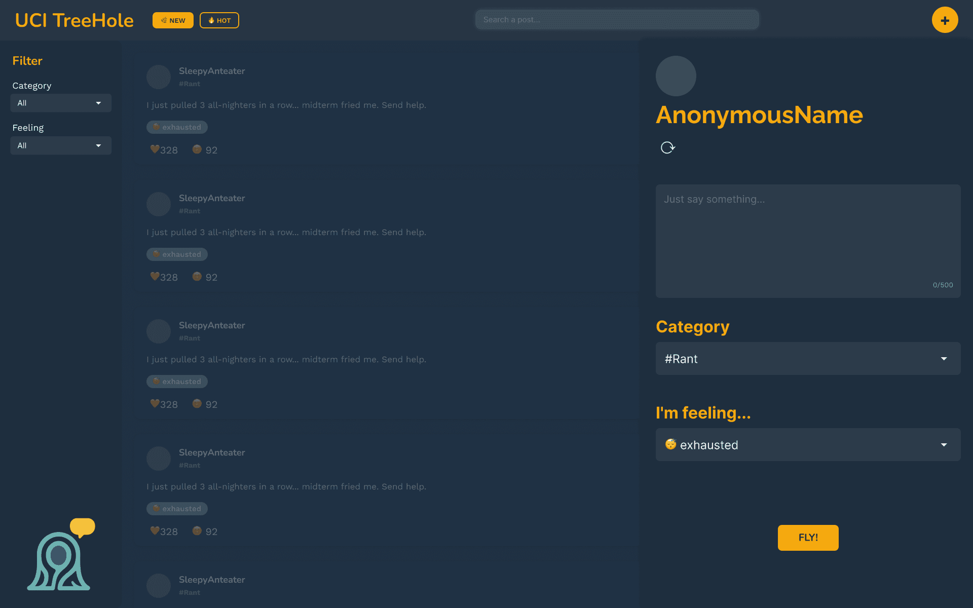
When it came to testing, we prioritized our Figma prototype, which was intended to be a reference for how the deployed platform would look and work.
This Figma prototype, shown below, is what we used to conduct usability testing.
Users have a preference for a sleek and familiar, yet responsive design
For the most part, we received positive responses to our refined design. With all essential changes being prioritized, we left this project with the intent of leaving any other changes to potentially be worked on later.
Common likes from users included…
The clean and lightweight interface
The emotional "feeling" tags, as they assist with adding personality and tone to posts
How simple the post creation flow is
The ability to refresh anonymous avatar
Interaction patterns are similar to other platforms they use (e.g. Reddit)
Meanwhile, common dislikes included…
Lack of visual feedback or confirmation (e.g. submitting posts, click reaction)
"New" and "Hot" tabs are too visually similar
Wanting to click anywhere on the post card to expand it — not yet functional
Not being able to react to comments — not yet functional
Emoji reactions do not have tooltips or labels — not yet functional
03
Our first React prototype
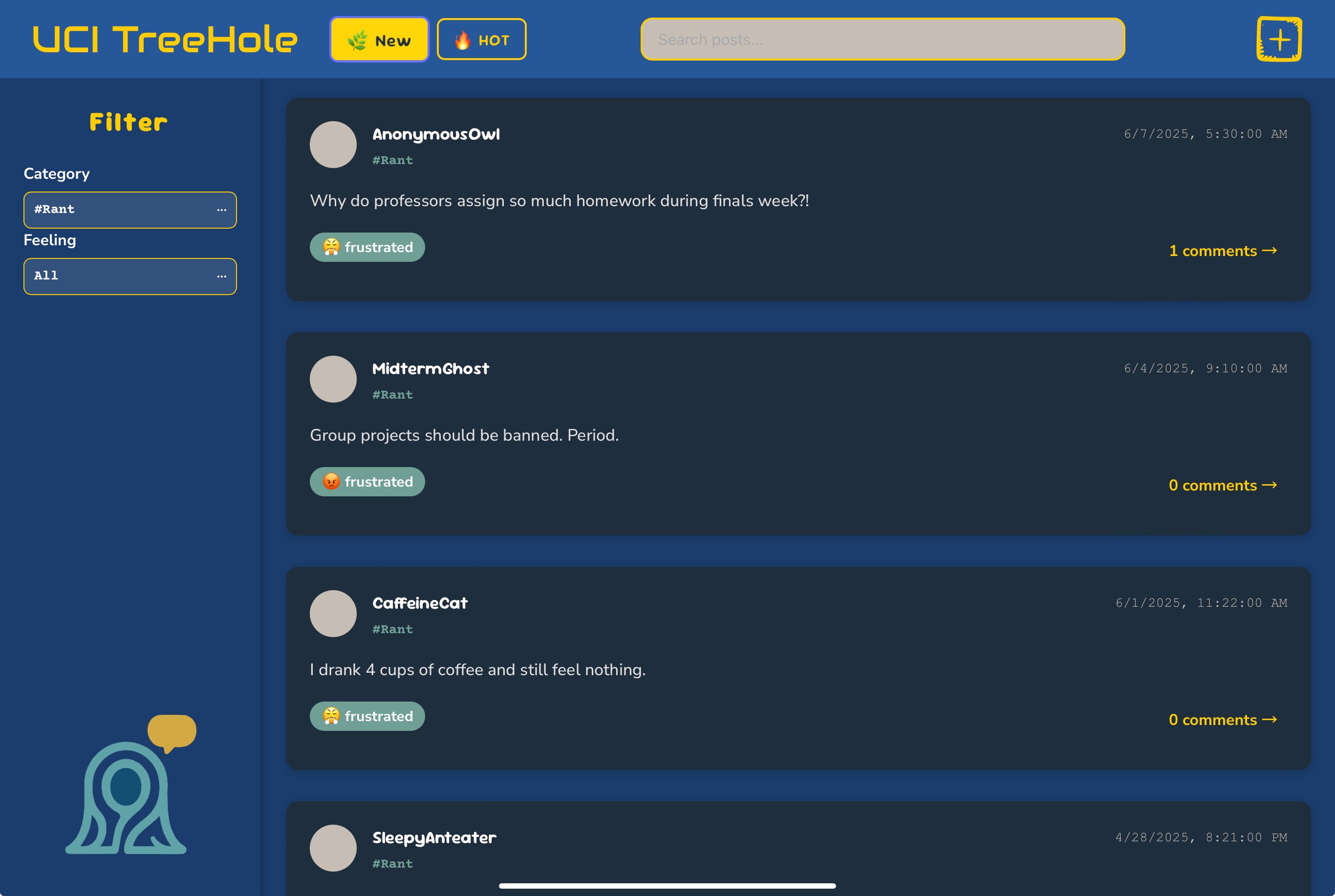
Blue and yellow — Zot Zot Zot!
In terms of visual design, our team settled on shades of blue and yellow for our final submission — as a nod to UCI’s school colors — to make our app feel catered to its students. As for platform design, this prototype addressed a chunk of feedback-related issues in order to make it more functional.
Below is a screenshot of the deployed prototype created by our programmers.
Next steps
Provided that we continued to work on this project past its submission, we would have continued to implement user feedback and functionality for all micro-interactions. Additionally, some other directions we would have taken would likely be…
Refining visual design, typography, and color to work cohesively — especially with UCI's more vibrant colors
Creating a step-by-step "how to" introduction to the platform, upon signing in
Conduct A/B testing on features, such as selecting an anonymous profile
Lastly, being able to develop this product in full would also require integration with UCI credentials, as well as completing backend work for database storage and manipulation.
Our product in use
A prototype clip of this prototype will be available soon! In the meantime, the deployed prototype is online and accessible.

