Role(s)
Product Designer
Timeframe
3 months
Toolkit
Figma, Wix


Problem
Undergraduate seniors tend to encounter difficulties when searching and applying for jobs, as they frequently receive rejections or are ghosted by potential employers. As a result, students face uncertainty regarding their ability to break into the workforce.
Solution
By joining career-path focused communities, students can get in touch with other students (and professionals) for valuable insights on the industry, company culture, and roles. This app is a created space for community support and advice.
How might we support undergraduate seniors in developing peer support as they navigate the job hiring process?
01
Learning about our users
Prior to conducting research, our team made a lot of assumptions about what our users wanted — especially because we were part of that target group.
So, we began to interview fellow college students, who provided the following actionable insights.
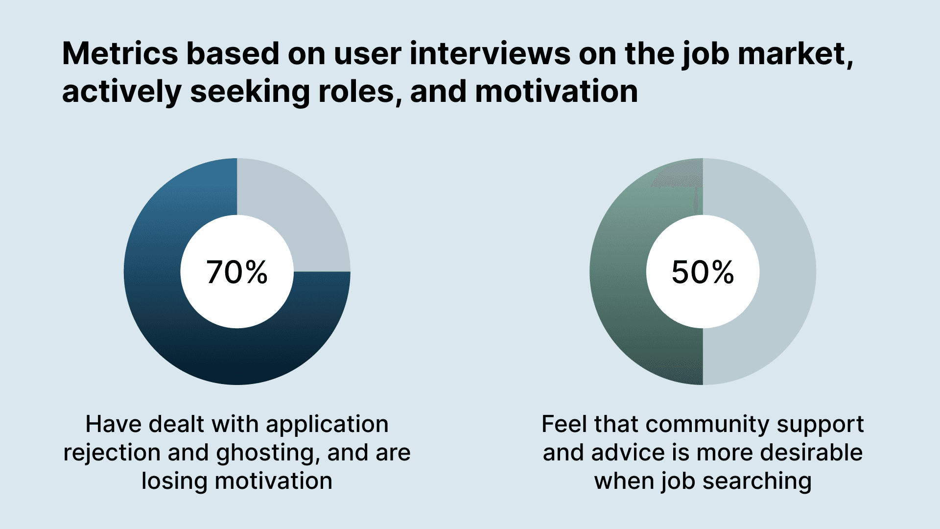
Student job seekers prefer an anonymous community support system, but want feedback from reliable people
Ghosting and lack of transparency make it difficult to understand why individuals are getting rejected
Absence of feedback leads to self-doubt, frustration, and loss of motivation, making it harder to consistently seek out positions
The overarching takeaway we received was that users seek community support in the current job climate, as they feel that it will uplift them to become better prepared.
02
Bringing users together
When designing this app, our team focused on incorporating familiar features, such as…
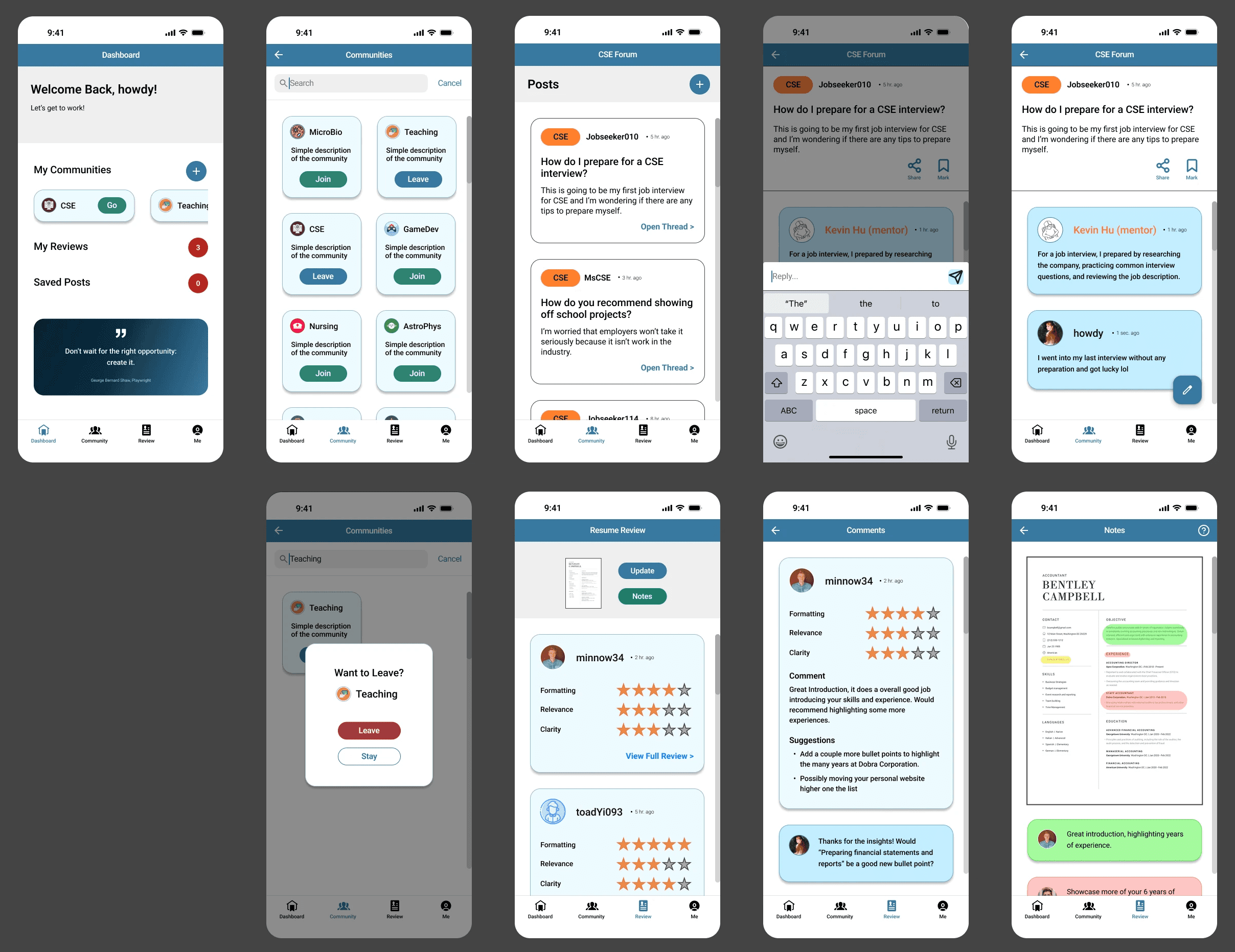
Career-based communities
Search for communities related to your career path
Join and leave as many communities as you'd like
Semi-anonymous community forum with peers and mentors
Post questions to the forum
Make comments on posts
Anonymous messaging
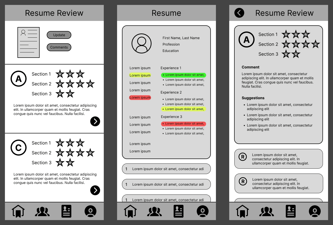
Resume review system
Star rating for different components of the resume
Expanded view of resume, with color coded suggestions
But first, we sketch
Before designing digitally, our group came together to sketch our ideas and decide on layout and general flow for our core features.
We then condensed our ideas into a sole design and replicated it as a short mid-fidelity prototype in Figma. This was presented to others, in order to determine if the general app flow is intuitive.
Preliminary Feedback
After presenting our mid-fidelity screens to our peers, we learned that…
Users were unsure of how our 3 core features connected to one another
Users could not decipher how interactive elements were meant to be interpreted
Moving into the next phase of design, we took our peers' feedback into consideration to make a prototype that was more intuitive.
Usability Testing
Our peers and professor/TA made many suggestions for improving our interface, but here are a few that we incorporated into our final design:
Resizing screen elements to consider a phone's status bar and footer space
Including a dashboard and classifying pages with text under each tab icon
Clarifying what colors mean and implement color roles throughout the interface
Making actions more noticeable (e.g. FABs, color indication)
So, leading up to our project submission, our team reworked our prototype to have a more understandable flow and overall appear more polished.
03
Putting it all together
A refined, balanced look
Refining and ensuring consistency in our final prototype was one of my main roles on this project, aside from delegating tasks and creating the prototype flow.
I utilized resources, such as contrast checkers and mobile design reference guides, to familiarize myself more with best practices for readable user interfaces.
Our app in use
A prototype video of this project will be available soon! In the meantime, feel free to try our brief prototype on Figma.

