Role(s)
UI/UX Designer
Timeframe
2 months
Toolkit
Figma, Google Workspace


Problem
Students claim that Canvas quizzes are stressful to use, particularly they worry about accidentally pushing buttons, forgetting to answer questions, and not being able to navigate the quiz seamlessly.
Solution
By redesigning the Canvas quiz to include visual aids, double confirmation, and question filtering, students can have a seamless experience and can focus their cognitive load on quiz content.
reduce stress overload in college students' online quiz-taking experience?
01
Evaluating usability and discovering pitfalls
Applying principles of usability and accessibility
Prior to beginning this project with my team, I completed an accessibility and usability evaluation of Canvas — as a whole —, where I concluded problem areas to target in this redesign, referring to Shneiderman's 8 Golden Rules of Interface Design and WebAIM's core principles of accessibility.
The ones we focused on for this case study were:
Lack of Easy Reversal of Actions
No ability to undo an assignment submission, if "Submit" is pressed accidentally; can only be “resolved” through resubmitting (if permitted by instructor)
No double confirmation before an action is done (e.g. accidentally starting or submitting a quiz before finished)
Potential Barriers for Users
Low contrast in main navigation menu and link text
Heading levels out of order
Descriptive text missing for fields and buttons on quizzes
Some secondary keyboard functions are not consistently accessible (e.g. “Select file” checkbox)
View the full evaluation I conducted here.
Our team's interest in redesigning
Considering that my team was composed of college students, who were expected to use Canvas — for most classes — we had our own beliefs about what needed to be revamped to make a better user experience. Our own experiences made this case study that much more compelling.
Although, we could not allow our own beliefs to sway our design decisions. Therefore, we recruited fellow college students to give their input on the platform and their experiences with it.
Interviewing users
Keeping Canvas' uncovered technical pitfalls in mind, we interviewed our target audience with open-ended questions about the platform, to uncover what issues are most prevalent. Some of the actionable insights concluded were that:
Users dislike wasting Quiz time
“I dislike the layout where questions have to be navigated through buttons”
“I dislike that timed quizzes require scrolling to the top of the page to see the time remaining”
“Personally, it’s helpful to have the time marker popup notification that says ‘__ minutes left’”
Users worry about making an input mistake
“I’m scared of accidentally hitting the back button and losing my materials”
“I’ve accidentally submitted a quiz and forgot to answer a question or two”
Based on the majority's responses, it was important that my team focused on the Quiz feature to ensure that users feel at ease and in control of their quiz-taking experience. Our interviewees confirmed that double confirmation and a rearrangement of layout components were top priorities.
02
Ideating an improved layout
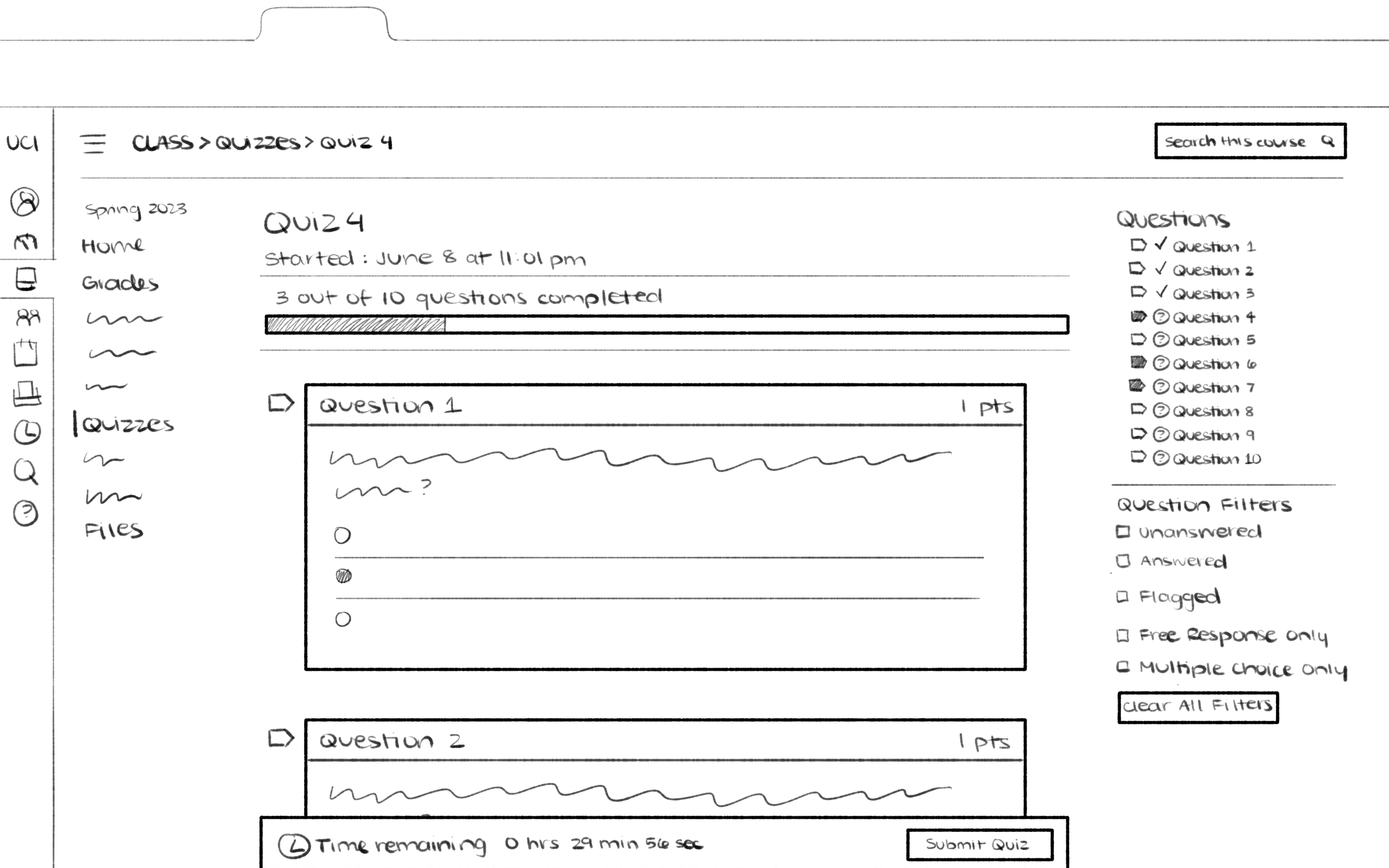
*Note that in our redesign, we left out the quiz description and instructions, as the intent was to put more emphasis on the quiz itself. Prior to conducting testing, we would insert an "More Details" icon to show those details in a popup window.
Sketching the redesign
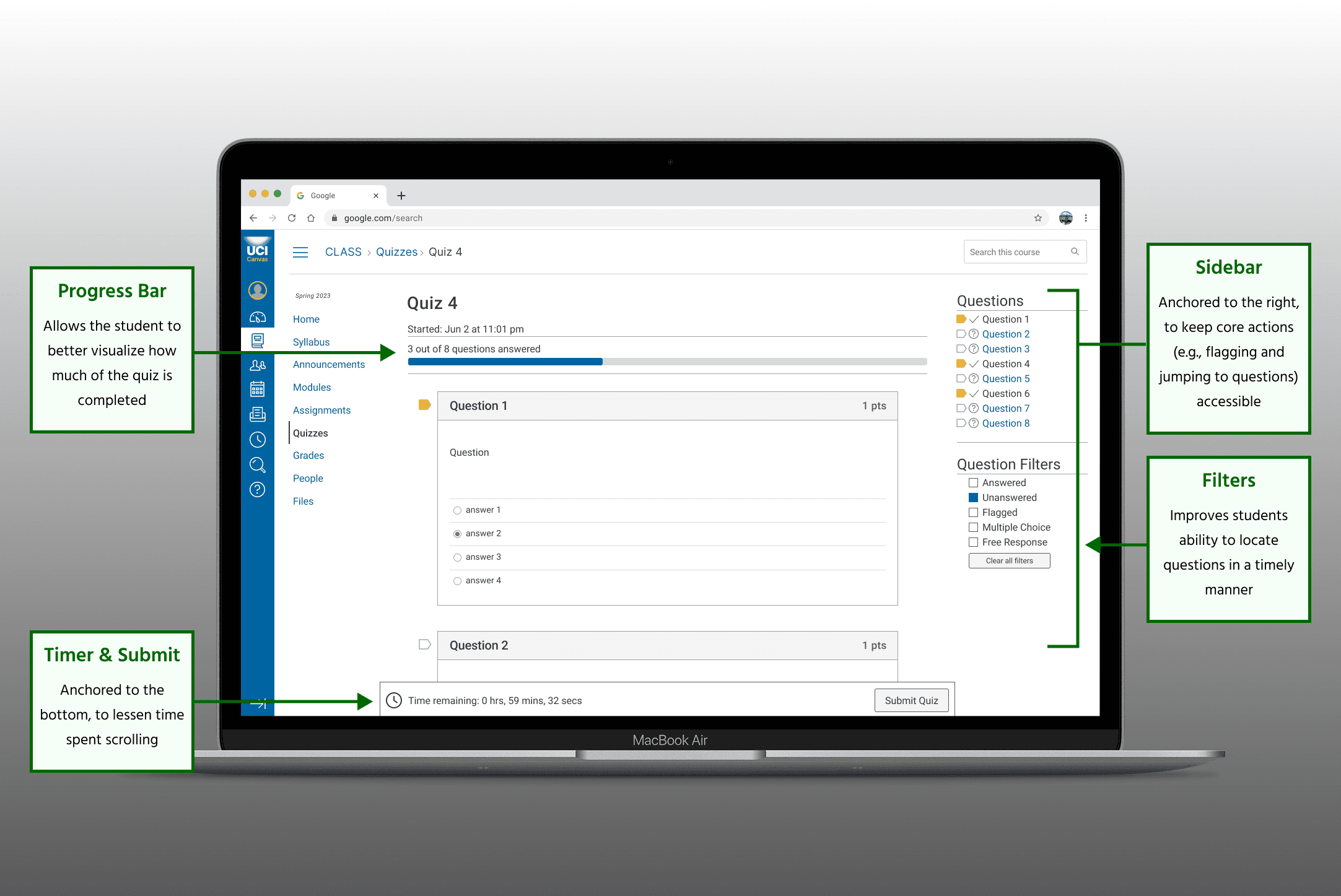
For our sketched redesign, the general layout was to stay the same but with…
A quiz completion bar added right below the title (and subtitle)
Quiz filters available on the right sidebar — which is to stay anchored
The "Time Remaining" and "Submit" buttons anchored to the bottom of the browser
Including a double confirmation message when the “Submit” button is pressed
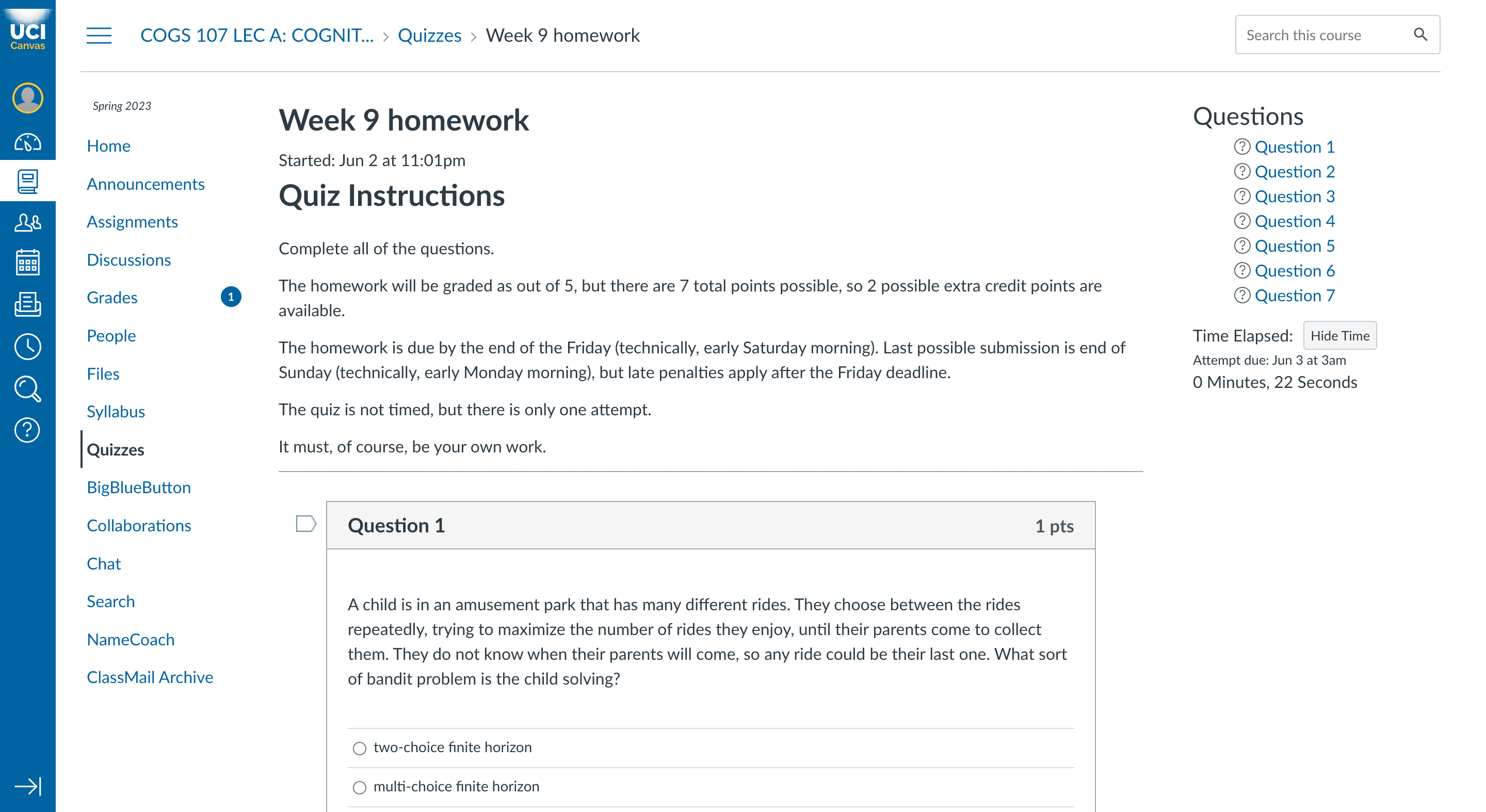
A screenshot of an example quiz is shown below, followed by a screenshot of our proposed modifications (sketched).
Replicating the visual design in Figma
As the primary high-fidelity designer, I began to refine our design by creating a style guide based off of a Canvas screenshot. Then, I moved onto component placement and layout, still utilizing that screenshot to ensure that spacing, formatting, and icon sizes were as accurate as possible.
As other members of my team were responsible for creating our interactive prototype, I focused on making a detailed mockup to ensure that their process was as seamless as possible.
03
Our final product
The Figma prototype
The final submitted product was a brief interactive prototype, created in Figma, to showcase how our changes would improve student's quiz-taking experience, as expressed by our interviewees.
In terms of visual design, our biggest goal was to keep a consistent look with the current platform, utilizing the exact same iconography, typography, and color palettes — just with improved features and UX.
Next steps
Moving forward with this project would entail:
Implementing a "More Details" button, so that users can see the quiz details, as a popup window, at any time
(Iteratively) gathering feedback though moderated usability testing
Refine, refine, refine!
After this, we would likely convert our (smaller scale) Figma design into a more extensive prototype, which could potentially be shown to professionals at Canvas!
Our redesigned platform in use
Below is the final prototype my group submitted, which includes a demonstration of our 3 core features.

